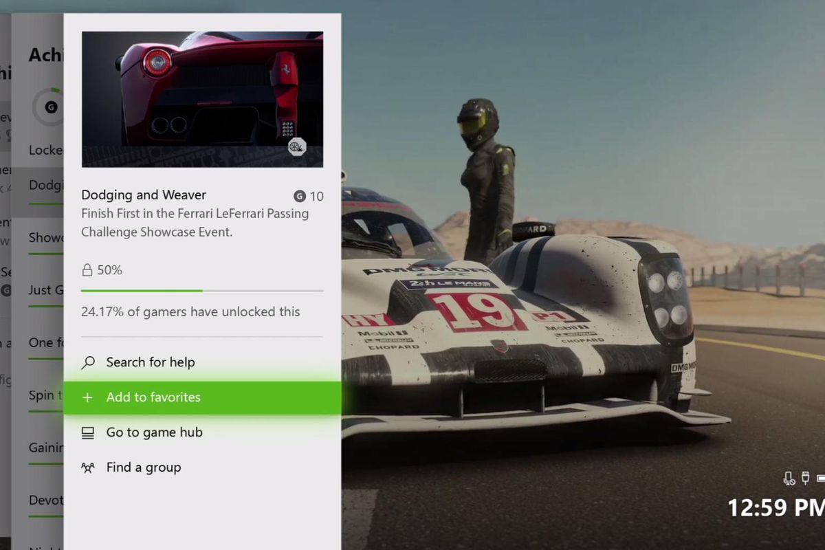
For a long time, Microsoft’s Xbox One has had a dark-theme. The company announced at Gamescom press event that they will be introducing a light mode for the Xbox One. For a while the company has hinted at giving us a light mode, but today we get a good peek as to how it will look.
Microsoft’s Xbox vice president Mike Ybarra revealed the light mode of the dashboard. If you take a look, it will remind you of the Xbox 360 classic UI look. Seem familiar, right? The light more is a lot “lighter” than the current theme, but it’s more of light grey.
Check out the all new Light Mode coming to the Xbox One UI ☀️ #XboxGC pic.twitter.com/cDLc1NxogU
— Xbox UK (@xboxuk) August 20, 2017
Microsoft is currently testing a new Xbox One dashboard that is due to be released later this year. Currently, the dashboard is being tested alpha ring Xbox Insiders. One of the things to expect is a new home area for pinning games. In addition, the company has tweaked the guide so it will make it easier for everyone to navigate with a controller, and made some built-in apps snappier.
The new light mode is due to be released in the next Xbox One dashboard update, and will be released in some time October.


